Challenge
Design and create a reusable card component guided by clear rules to replace all the various cards used in our applications. Develop a process for designing, developing, implementing, and maintaining the cards so they can scale efficiently and consistently.

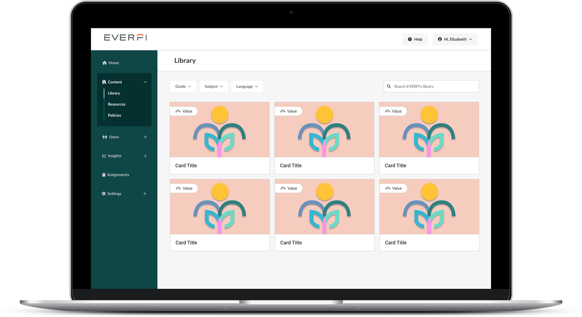
Report Page - Before/After
Background
EVERFI is an ed-tech company that aims to fill the "missing learning layer" of education through SaaS solutions and digital courses in sectors including K-12 education, workplace & campus, live training, and content marketing. Alloy is EVERFI’ss design system, created to support the design and development effort of EVERFI’s multiple applications serving multiple user types and experiences.
When I joined EVERFI, Alloy was a work-in-progress style guide with a few components in working code, some components designed but not yet implemented, and many missing components and patterns. One of the initiatives Marianne Epstein, our director of UX, led was to mature Alloy to be more versatile, usable, and comprehensive. More importantly, we set out the goal to have one source of truth for every component in Storybook as a way to develop, test, and maintain Alloy in code that could be readily reused throughout our applications.
As part of this initiative, I designed and help implement several new components such as cards, tables, and pages. This work is about the Alloy card component. Cards are an important component of our application since we use them as visual displays to showcase our content: courses, lessons, events, reports, etc. They need to be easily browsable on any device, and visually appealing to promote and elevate our content. They should accommodate different needs: display a big media or stat or a small image, display multiple buttons or labels, or act as a container to expand and collapse. I was on a mission to design one card to meet all these needs!
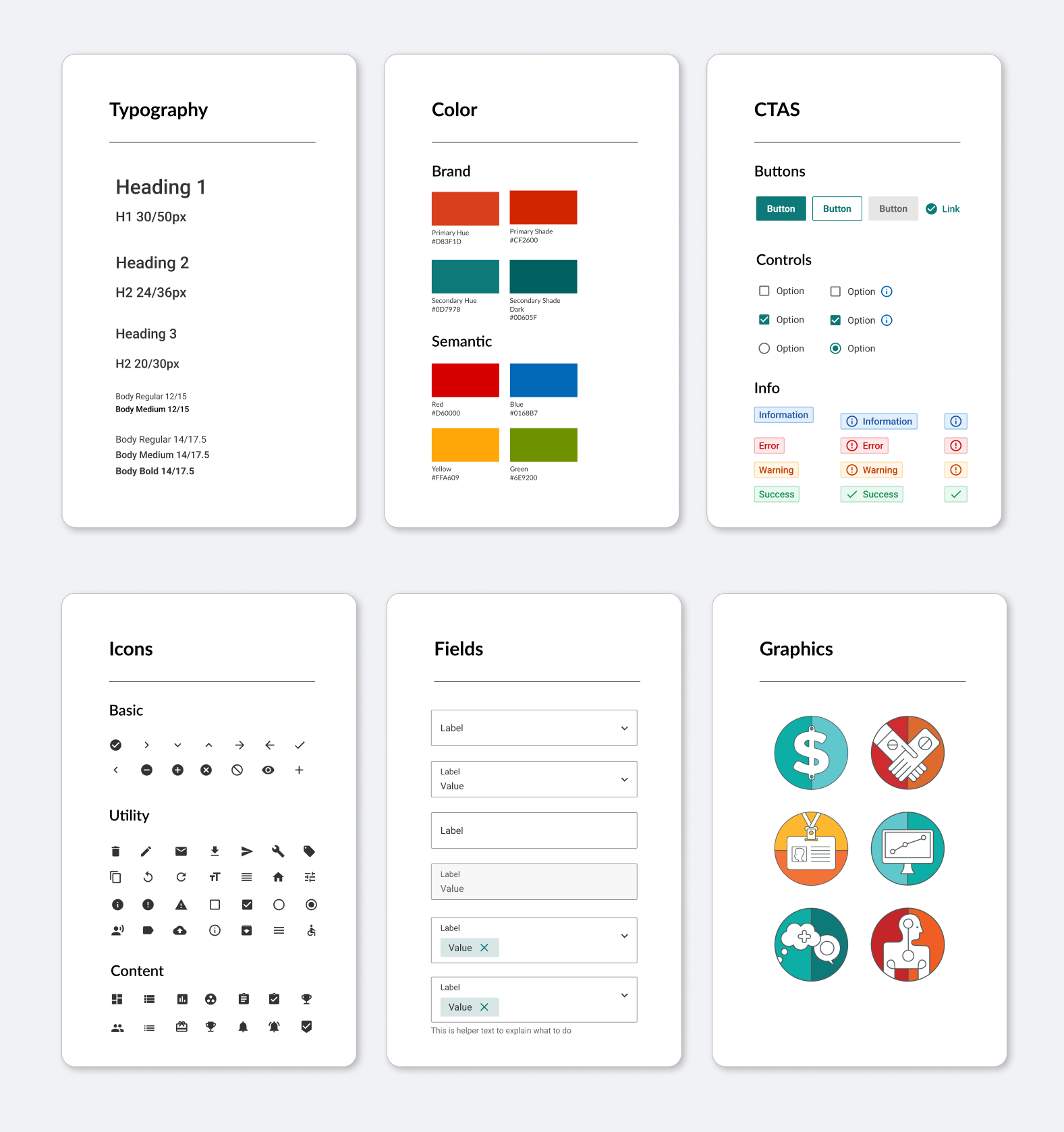
A snapshot of the Alloy component library
Design Process
I conducted a thorough audit of all of our applications to understand the range of cards in use and the issues with each. Next, I defined requirements, including the needed attributes for any given card as well as a new layout for the pages where cards would sit. I tested the new card concept against all use cases identified in the audit, then created a comprehensive spec to communicate the design with the front-end dev team. Finally, I helped QA and implement the new card component across our applications.

Design Process - Alloy Card Component
Define & Discover
To better understand the design criteria of a reusable card component, I did a thorough discovery of how cards are being used, how they scale, and what subcomponents they have.
Product Audit
I did a comprehensive page-by-page audit of all of our applications. This step was important to uncover the issues that needed to be addressed, the requirements for the new card component, and to keep a record of where cards appeared in our applications.
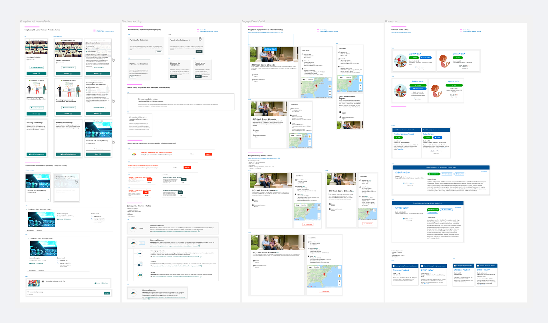
Inventory of all cards across Everfi's applications
Use Cases
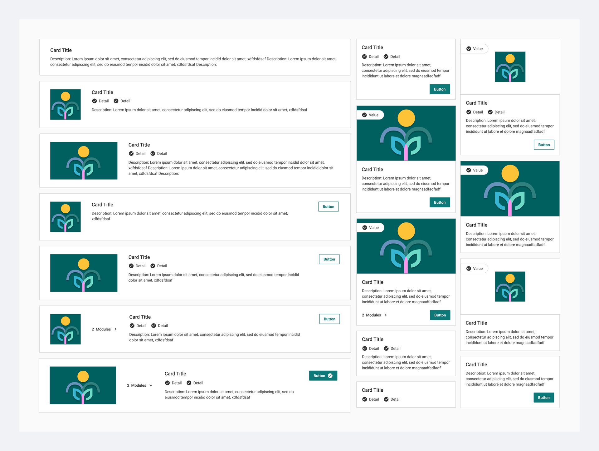
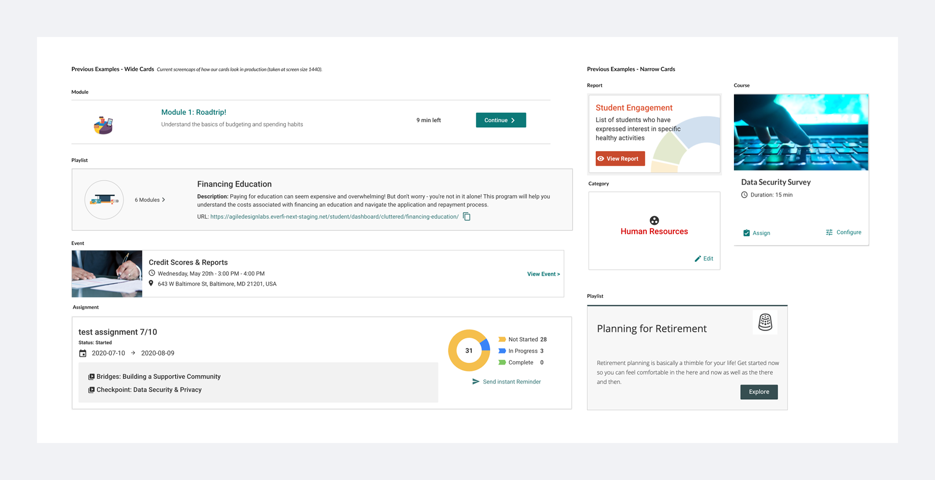
We found out that we had designed and developed 24 different cards across our ecosystem; each card was slightly different in style, size, interaction, and responsiveness. Every time a team needed a new card, we had designed and built a brand new one. As a result, we introduced visual and interaction inconsistencies across the application.

Variety of card sizes and styles
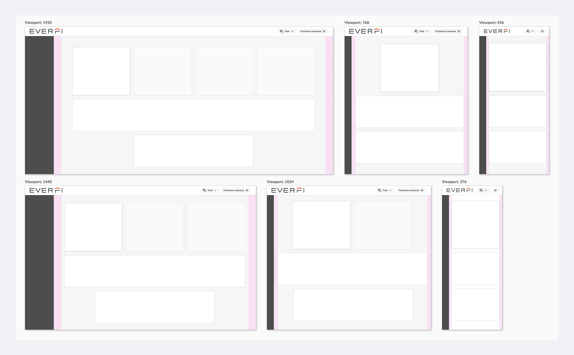
Another issue we found was that our existing layout for pages with cards did not have consistent padding, and, more importantly, rules for designers to understand the page behaviors as viewport sizes changed. The image below shows how report cards are placed in 1920, 1440, and 1024 viewports.
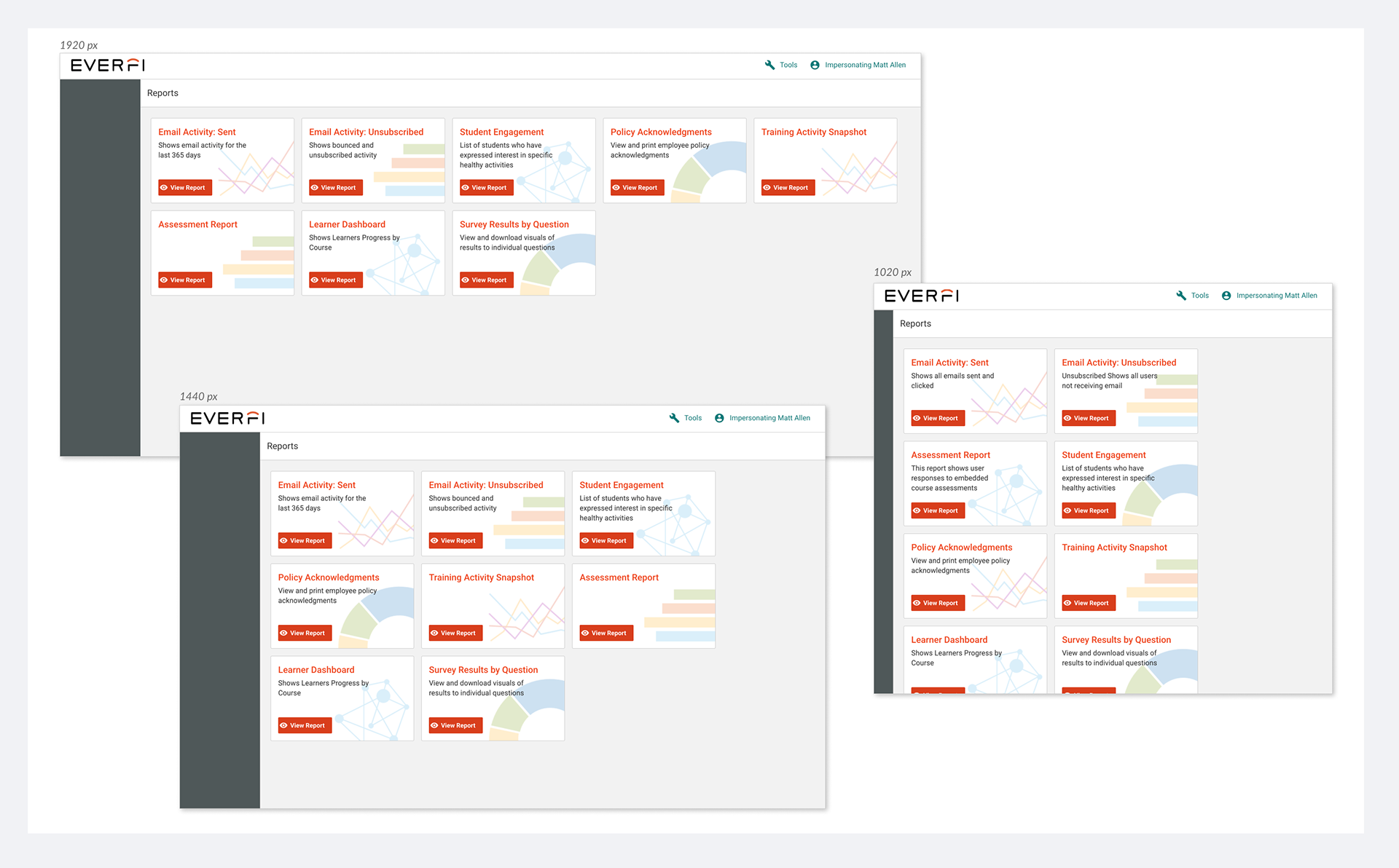
Report page layout issues
Inventory
I listed all instances of cards we found and organized them by categories: the object they represent, size, details, how they scale, and their placement against layout. This exercise helped me see the variations in each category. For instance, I found out that we had 12 different sizes of cards but we only needed three variants; narrow, medium, and wide.

Design & Iterate
Having a clear list of requirements based on our inventory, I defined a card with attributes and variants that could address all of our use cases as well as a responsive layout. In an iterative process of designing and checking against use cases, I came up with one component that could address all our needs.
Definition
A card is a container display for a single object. This is in contrast to a table row, which is a better container display for objects that rely on other elements for context.
Card Layout
To design a responsive and scalable card component, we needed a new layout with guidelines on how cards are placed in relation to one another and the rest of the page elements. I collaborated with Marianne Epstein, who was redesigning our layouts, to create one for pages with cards. Through many iterations, we were able to define a new layout that could accommodate three different card sizes (narrow, medium, and wide), how each size scales as viewport sizes change, and how they were placed in relation to one another on a page.
New card layout
Attributes and Variants
After many design iterations and testing against the use cases across Foundry, I was able to define and abstract the card attributes and their variants.
Card Container:
Elevation: none, (x-1 y-1 b-4 s-1 color/000000 alpha/10)
Corner Radius: 0, 4
Background color: white, grey
Size: narrow, medium, wide
Card Elements:
Title: 18, 16, 14
Media: small: 110 (1:1), large 240 (16:9)
Parent/children: yes, no
CTA alignment: top, center, bottom
Details: text, icon, icon text
Descriptions: text
Label: text, icon text
Status: none, progress bar
With different combinations of these attributes, we could create many different cards that accommodated our needs across our applications.
New card component tested against use cases
Responsive Design
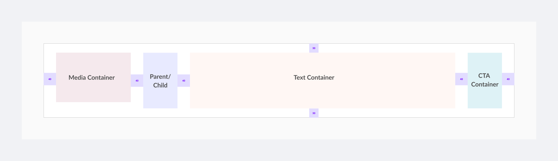
As mentioned above, the card container changed size based on the card layout we defined. However, in order for all the cards’ elements to scale properly as screen sizes change, I needed to define a detailed set of rules that determined how the elements that a card needed to accommodate will change to fit the viewport and look beautiful at the same time.
I defined 4 sub-containers to accommodate any possible number of elements with rules for each sub-container.
1. Media Subcontainer: any media including an image (large or small) will be placed in a fixed-width media container.
2. Text Subcontainer: Elements such as title, description, detail, and status will be placed in the text sub-container which has flex width with a min-width of 300 px.
3. Parent/children Subcontainer: the parent/children will go to this specific container with flex width
4. CTA Subcontainer: Any number of CTA will be placed in a flex width container.
Both wide and medium cards would scale down to narrow cards when the viewport changes to mobile.
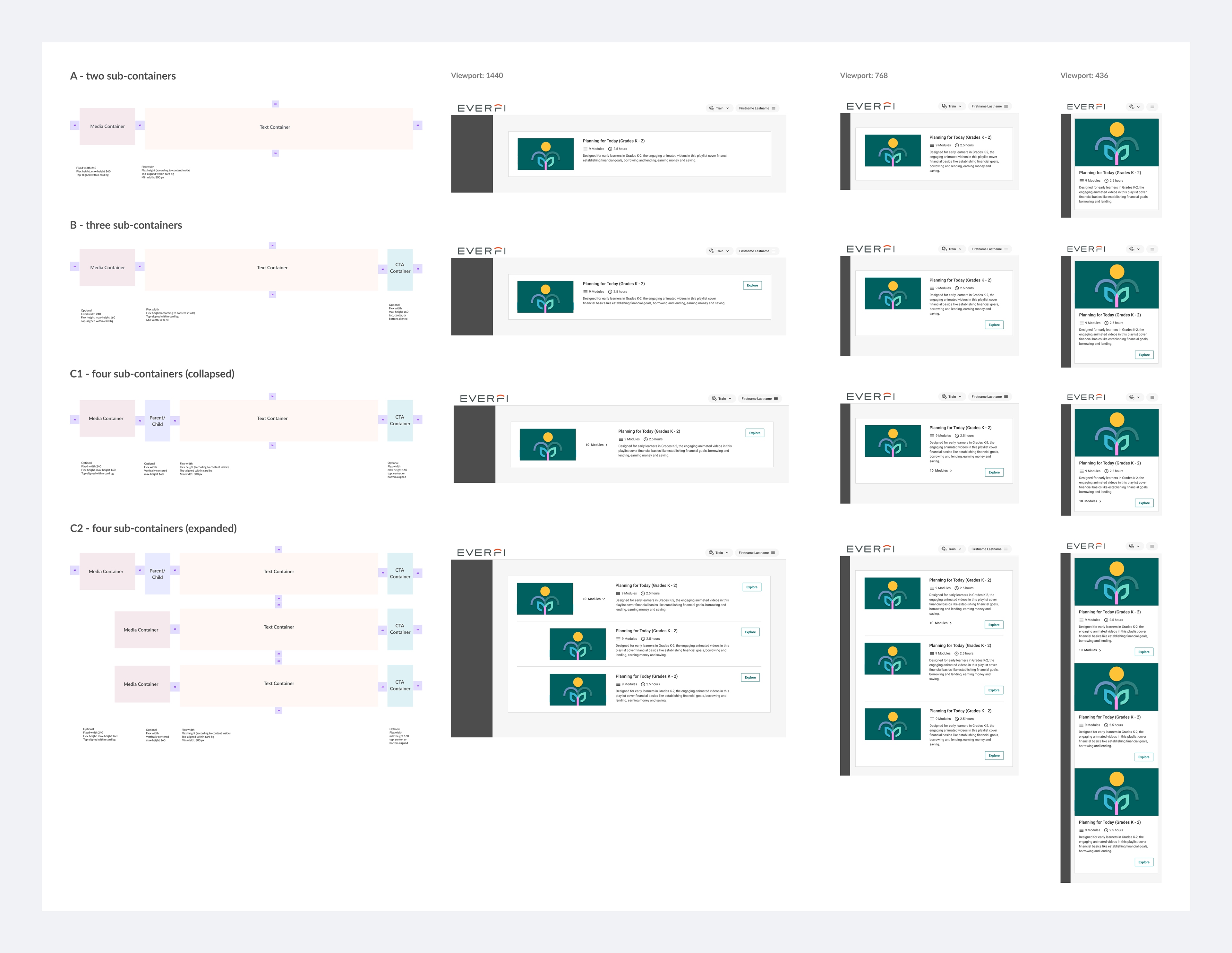
Taking all the use cases into consideration, I made sure that the new cards could accommodate all the variations.
Before - Various sizes and styles

After - use case with the new card compone
Spec
I created detailed specs to communicate designs with the dev. The designs included detailed visual specs with use cases for Q/A and testing. View detailed spec.
Storybook
EVERFI adopted Storybook to build all the Alloy components. Storybook is a tool for building UI components and pages separate from the application. It allows for the development and testing of components before being used in any application. One of Storybook’s great features is ‘knobs’ that help enact all of a component’s attributes and their variants. As the card component was being developed and released in Storybook, I conducted testing to make sure the card looked and behaved as expected and that the knobs cover all the variations we need. There were instances when we had to redesign some details but for the most part, we were able to develop the design.
Implementation
The next step was to replace the existing cards with the new component and layout across our applications. For each page using cards, I wrote a ticket to indicate the card attributes and variants. The effort to replace the cards with the components went seamlessly and we were able to create pages that were usable, responsive, and beautiful.
Lesson Learned
Designing multiple components and patterns for Alloy deepened my knowledge of design systems. Creating a usable and beautiful design system, like any other design task, starts with considering users’ needs within an application with the aim of creating consistent, usable, responsive, and beautiful experiences.
Creating Alloy was not just about creating components, patterns, and a component library. We had to establish new rituals and processes with the front-end engineering and quality assurance teams to make sure we have a product that meets the needs of both internal team members and our application users. We started a weekly meeting with engineering to talk about the components under development and the ones we were still designing. We also established a ‘desk check’ session as developers were working on each component to check in and make sure there is no blocker. Also to create and maintain a good design system, considering the needs of internal users including designers and developers such as team size, makeup, and culture is paramount.
“I am so grateful to work with Roshi every day. She is such a talented designer and a great teammate. One of the best things about working with Roshi is the way we can collaborate and bounce ideas off of each other, and the questions she asks to get to the heart of the problems we are trying to solve. Over the past year, she has done incredible work to evolve our design system and the design team's operations. She embraces all of EVERFI's values and I feel lucky to work with such a great colleague and mentor. Thank you for everything Roshi!’
by Alyssa Kjar: Senior Product Designer