Challenge
Understand hurdles faced by teachers during registration, and redesign the experience with the goal of increasing teachers’ conversion rate by 5%.
Why did it matter? Increasing the number of registered teachers is crucial to EVERFI’s business, as teachers unlock student usage and learning outcomes, the metrics our sponsors care most about (and pay us for). Also, given the yearly turnover in the K12 education system, it is essential to keep adding more teachers each year.
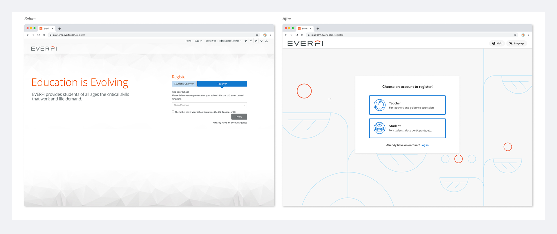
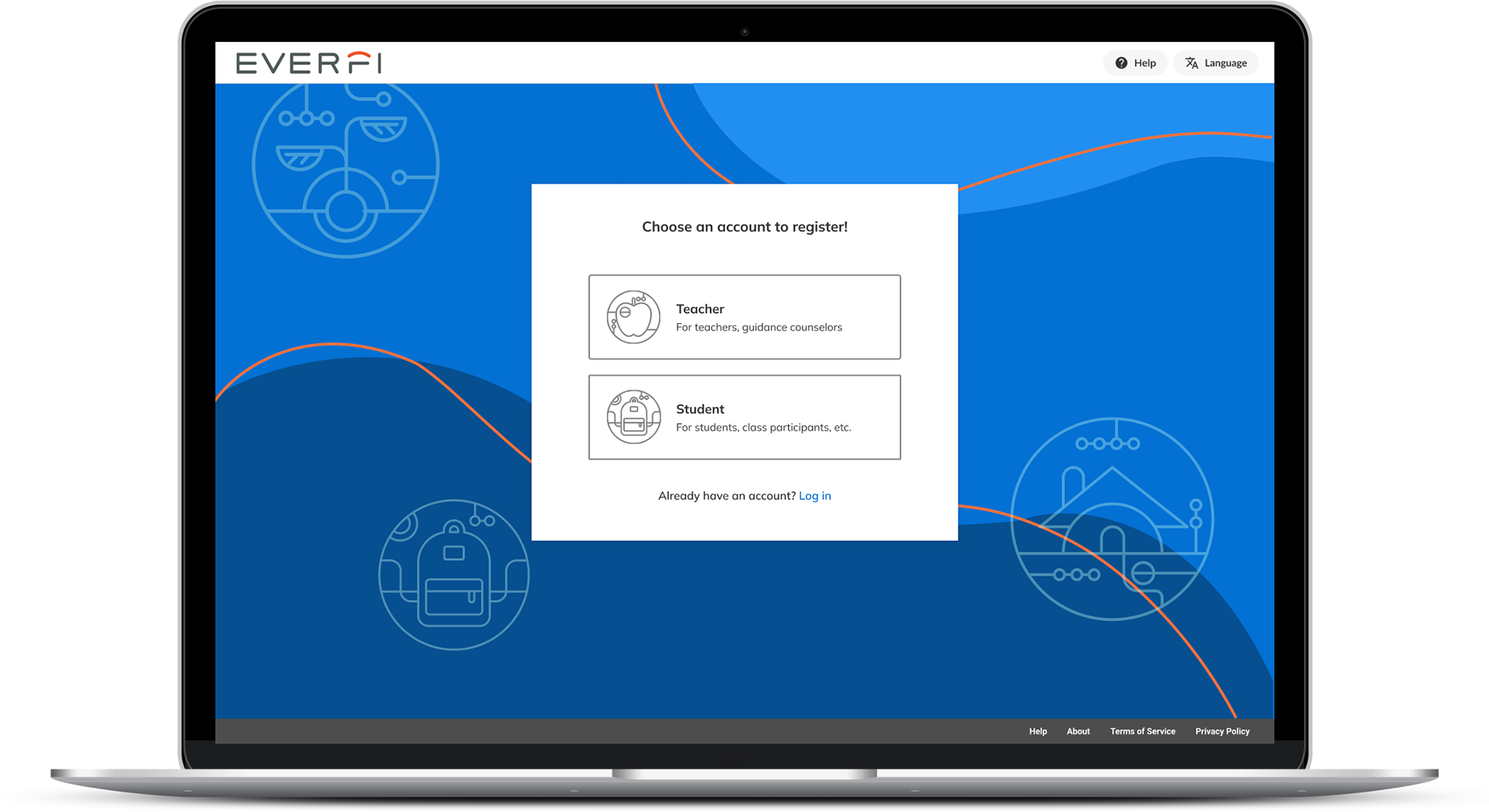
Registration Before/After
Background
EVERFI is an educational technology company with the mission to fill the "missing layer of education." EVERFI’s self-paced, interactive courses are used in the K12 classroom setting to teach critical life skills on topics such as financial literacy and mental well-being. These courses, free to teachers and students, are funded by private sponsors like the NFL and Meta, who want to support education in these areas.
Homeroom is the platform where teachers assign courses to students and monitor their progress. How easy it is for teachers to register and get started in Homeroom directly correlates to student usage of EVERFI’s courses - the metric sponsors care most about. So a frictionless registration experience was a top priority for the business.
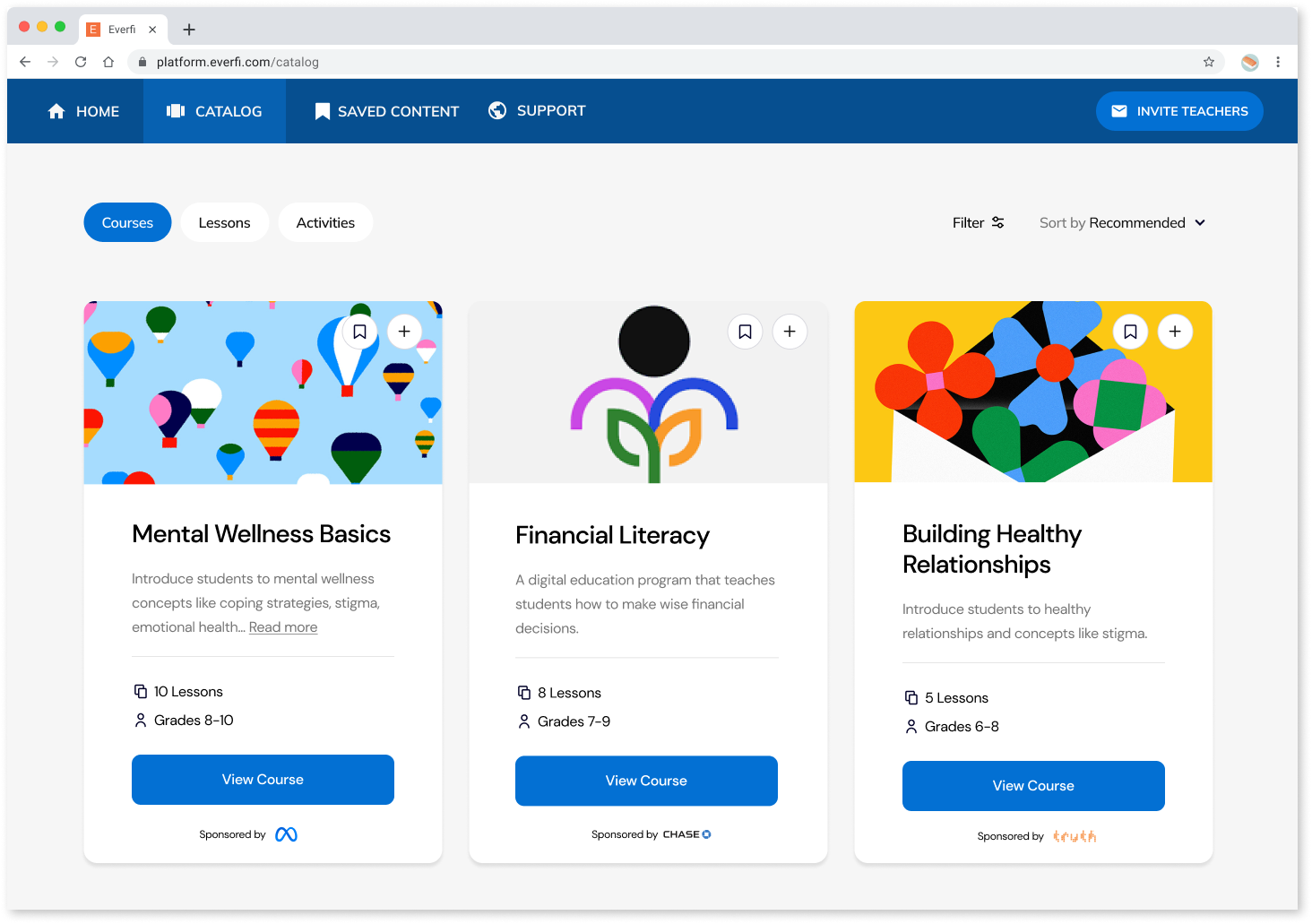
Screenshot of Homeroom Catalog
Design Process
I used different inputs such as user interviews and google analytics to define the problem statements. I designed and tested the design solutions before implementing them. After Implementation, I used google analytics to understand how the new experience performs to convert teachers and how I can further improve the experience.
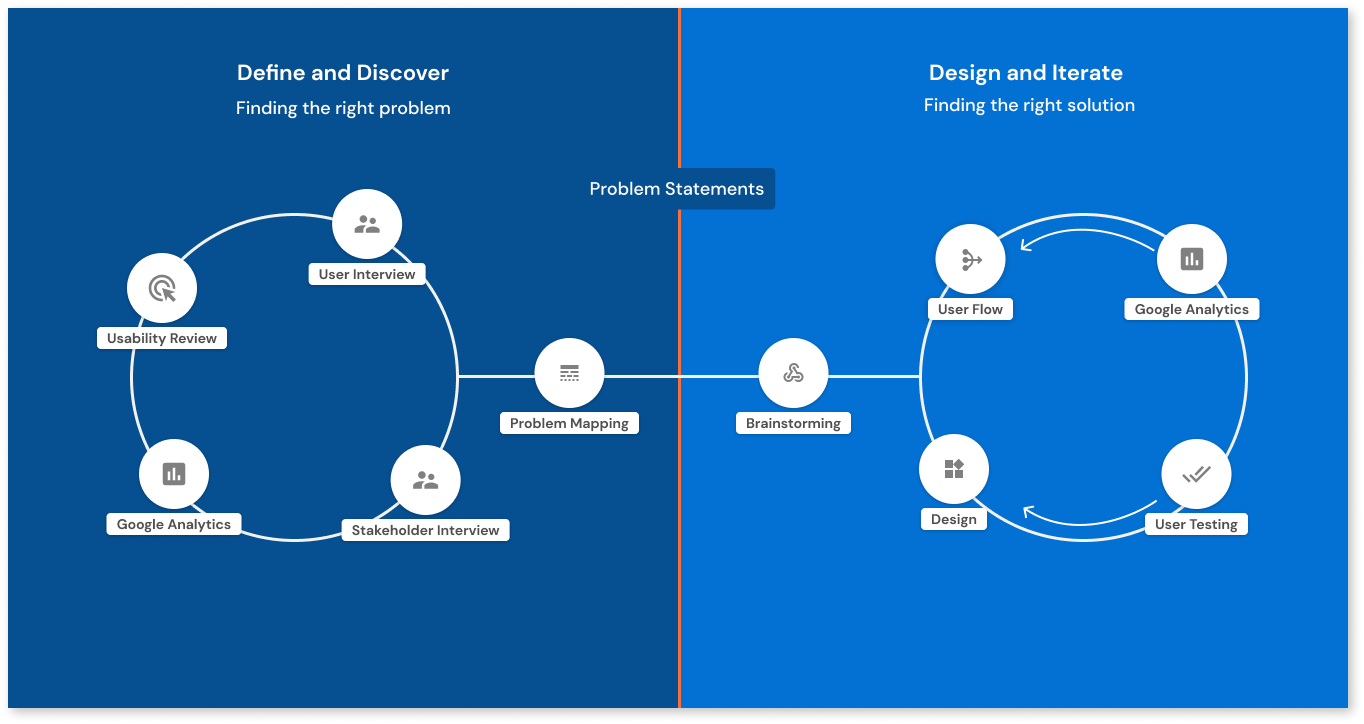
Design Process - Teacher Registration
Define & Discover
To better understand the hurdles teachers were facing, and to align the team around validated problems, I did a thorough problem discovery looking into different sources to pinpoint issues users were experiencing.
User Interview
I conducted user interviews of the existing registration flow with 5 new teachers over a video call. I asked them to share their screens and go through registration in Homeroom while thinking out loud. I observed users creating accounts and heard their feedback. I found many issues such as interaction and UI problems.
Usability Review
I conducted a page-by-page usability review of the registration flow to try out different use cases. I registered to a US, Canada, and UK school as well as registering to a generic school which is the suggested path when teachers cannot find their school. I found many issues from bugs to UI inconsistencies.
Google Analytics
Additionally, I looked into Google Analytics to understand how the registration funnel was performing. I found that:
1. 54% of teachers complete the registration process and convert;
2. 20% of teachers cannot find their school through the school search function; of those who cannot find their schools, only a small percentage begin generic school registration;
3. 33% of teachers drop off at the personal information/course selection screen.
Stakeholder Interview
Speaking with stakeholders and colleagues who were close to teachers on a daily basis, I uncovered similar issues about the school search function, its interaction problems, and the inconsistent naming conventions of the schools in our database.
Problem Mapping
After going through the discovery, I mapped the problems into the existing teacher journey with the aim of aligning the full team around validated problems. The problem statements against the user journey helped us prioritize what problems to solve and come up with some high-level solutions to kick off the design process. I synthesized the problems into 3 problem areas and wrote a user story for each.
Interaction Hurdles 👆 As a user, I want to register without any hurdles and in fewer clicks.
School Search Issues 🔍 As a user, I want to easily find a school to register into.
UI Issues 🎨 As a user, I want a consistent experience between registration and platform, and to fully understand the value of creating an account.
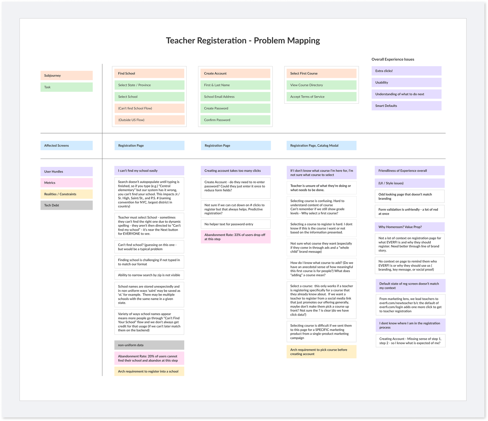
Interaction Hurdles 👆
Creating an account in Homeroom takes 12 clicks with these interaction issues:
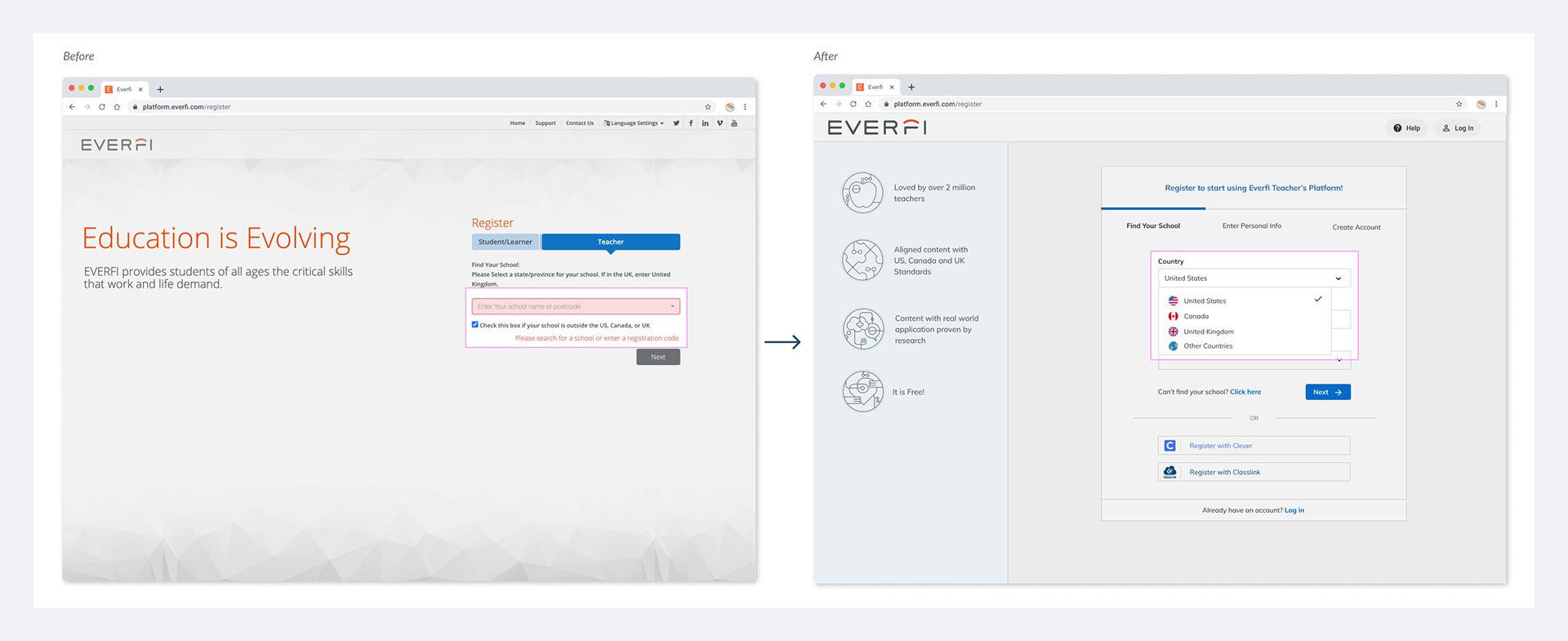
1. Users have to select a state or province without selecting a country first. The UK teachers have to select "United Kingdom" in the Province/State dropdown without any instruction;
2. Registering outside the US, Canada, or the UK is not possible!! The next button is disabled even when the checkbox is selected;
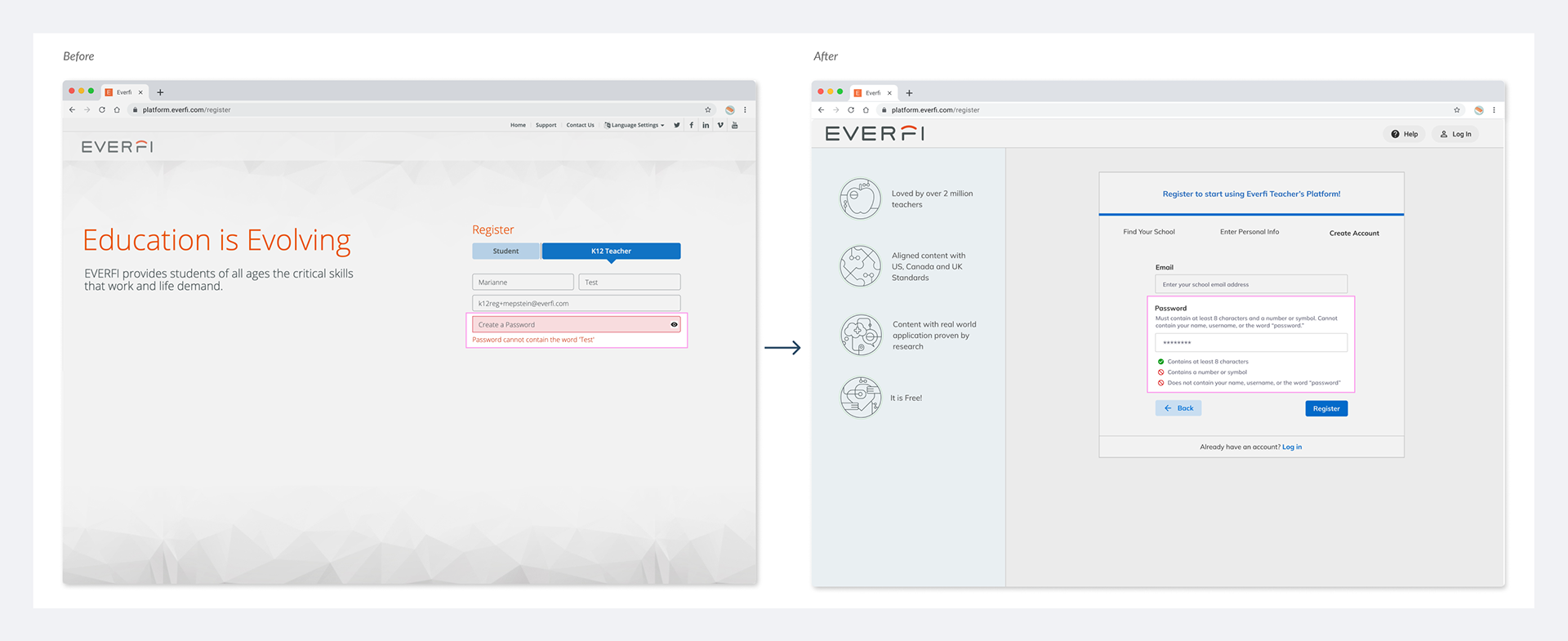
3. No helper text for password selection exists. The error messages only appear when users click the ‘Next’ button. This creates a lot of frustrations and does not help users choose the right password easily;
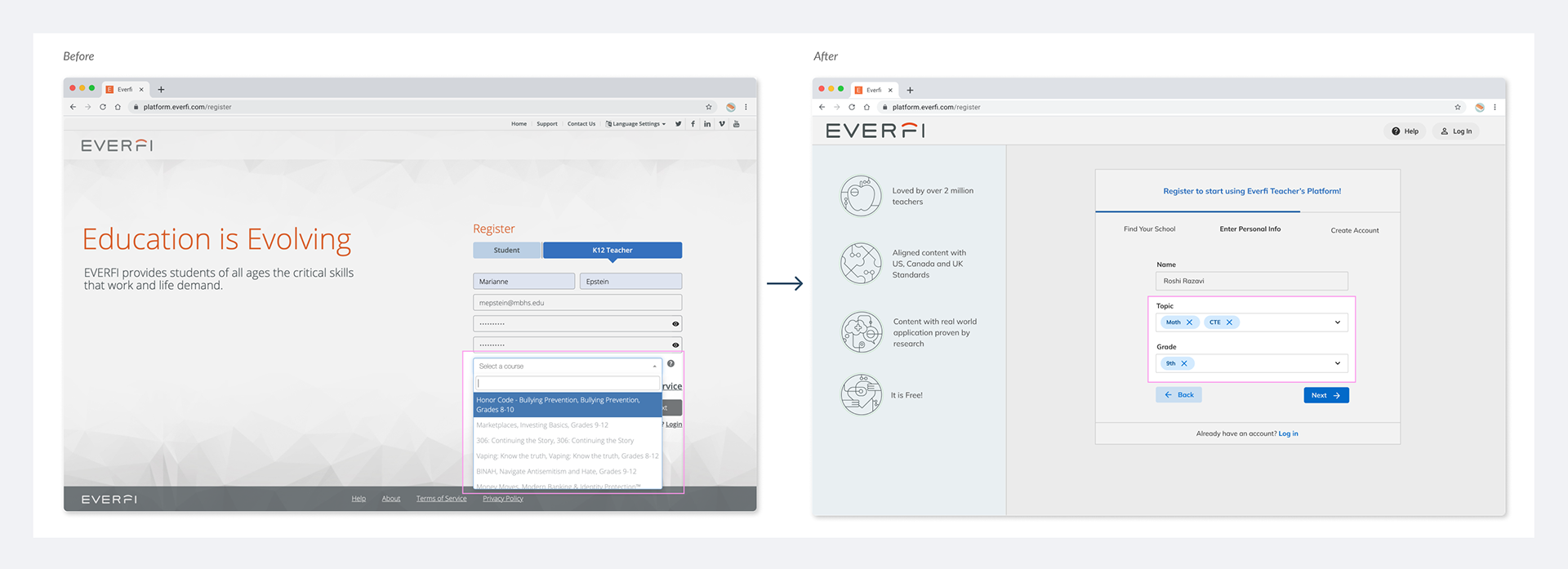
4. Teachers have to select a course as part of the architectural requirement of Homeroom. Teachers lacked understanding of the course(s) they needed to select during registration;
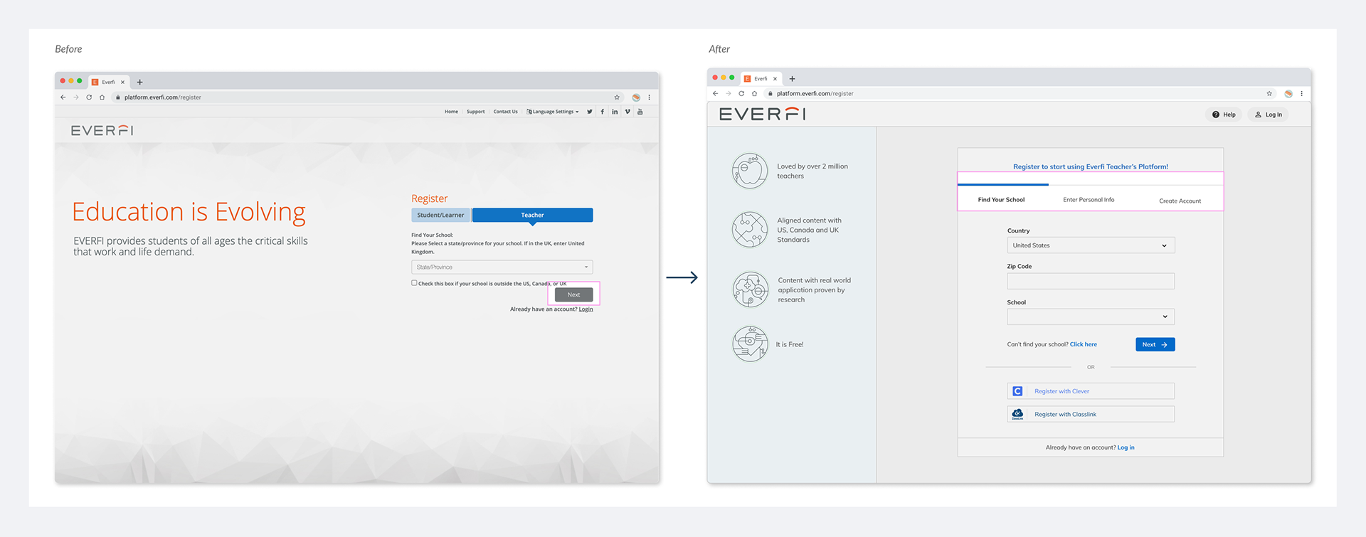
5. Finally, users don't have a sense of progress as they go through the registration.
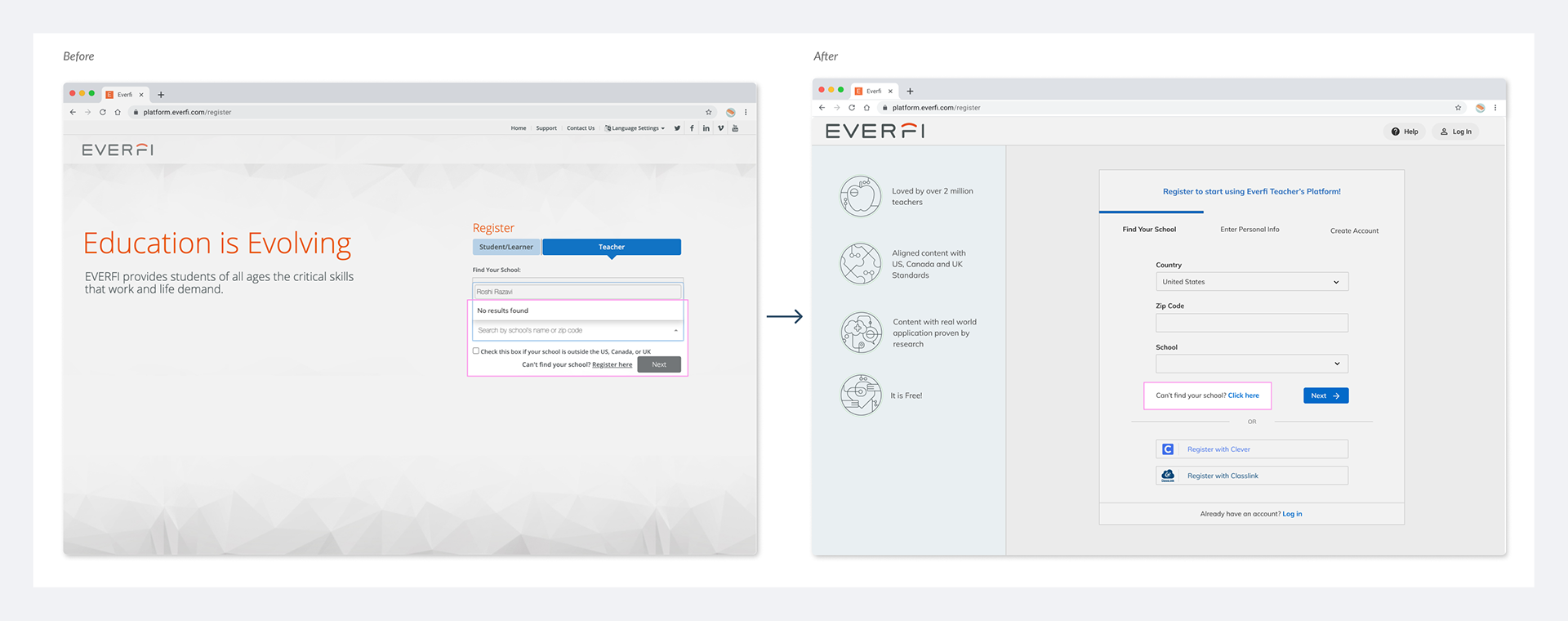
School Search Issues 🔍
Background: Teachers need to register into a school as part of the architectural requirements of Homeroom. Therefore, the school search function and its user experience are very important contributors to successful registration. As a backup, If teachers can not find their school, they are directed to another path to register into a generic school.
The interaction is defined in a way that the link to register to a generic school only appears when the search field does not return any result. During testing, I noticed that users who could not find a school did not end up choosing the generic path because it was unnoticeable. This observation was supported by google analytics. Additionally, the search function sometimes returned way too many results which made it difficult for a teacher to find the school they were looking for.
UI Issues 🎨
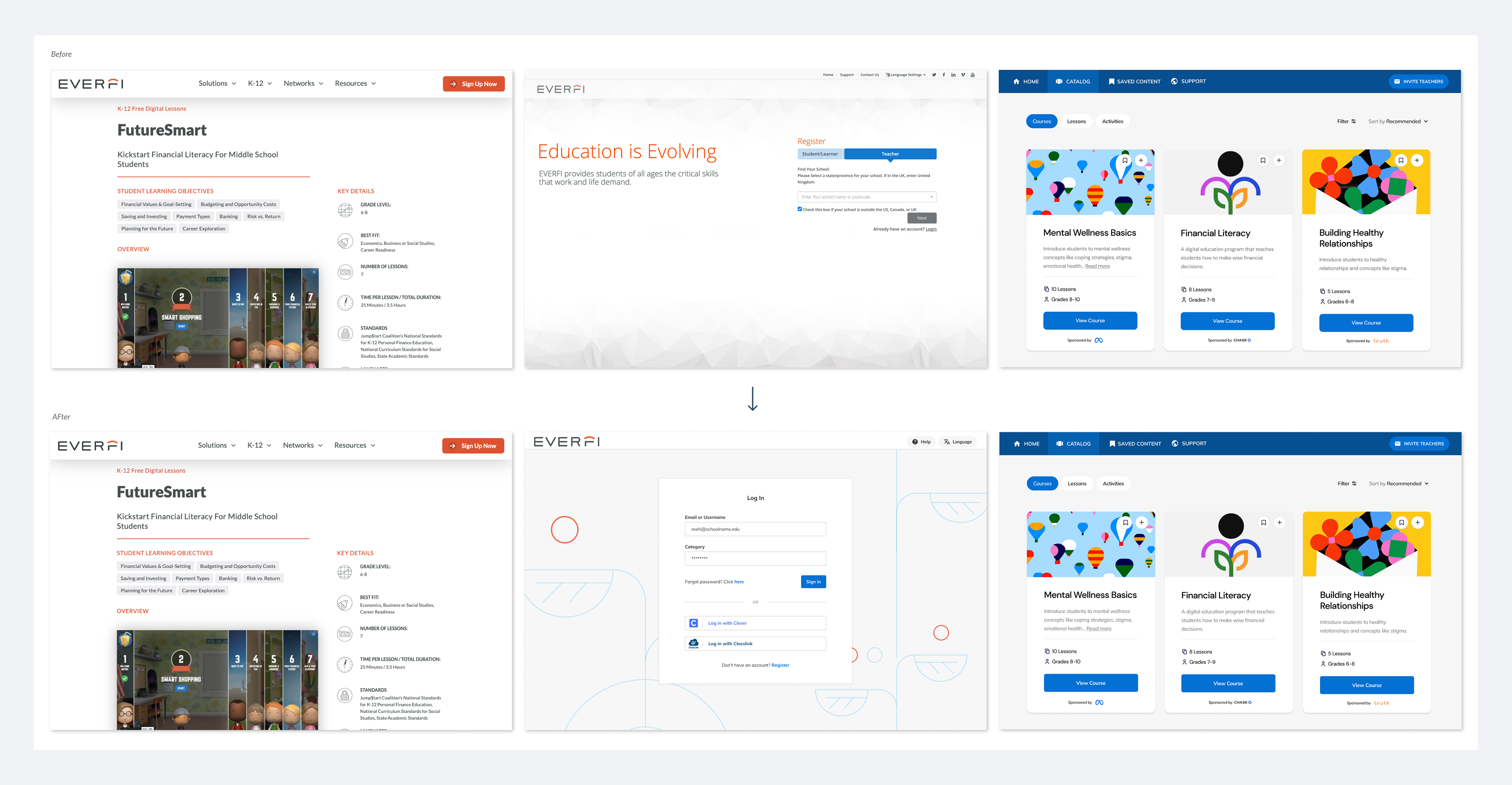
Homeroom was originally built in 2008. The marketing website where teachers come from to register and the in-platform experience got redesigned in 2018. However, at the time, the registration experience was de-prioritized and teachers were still presented with registration pages designed in 2008! Therefore there was a major UI misalignment as teachers moved from the marketing website to registration pages and the in-platform experience. Additionally, the registration pages did not provide reasons why a teacher should create an account; Teachers did not grasp the value of EVERFI and why registering is worth their time and effort by looking at the registration pages.
Design & Iterate
The design process started with a brainstorming session with members of cross-functional teams. After that, I created a low-fidelity prototype for user testing. I incorporated user feedback into high-fidelity designs and specs, then collaborated with the dev on implementation and QA. Lastly, I created a dashboard in Google Analytics to monitor the conversion rates as teachers used the new registration experience.
Brainstorming
I brought the cross-functional team for a solution discovery session where we brainstormed different high-level solutions to tackle the validated problems via architectural, interaction, and UI changes. In this session, we assigned a rough level of effort to each solution to help guide the design approach for each problem. I then mapped all these solutions to the journey map.
Low-Fidelity Designs
I started with schematics and low-fidelity designs to guide feasibility conversations for the solutions. I conducted usability testing with teachers using a clickable prototype. View the full prototype here.
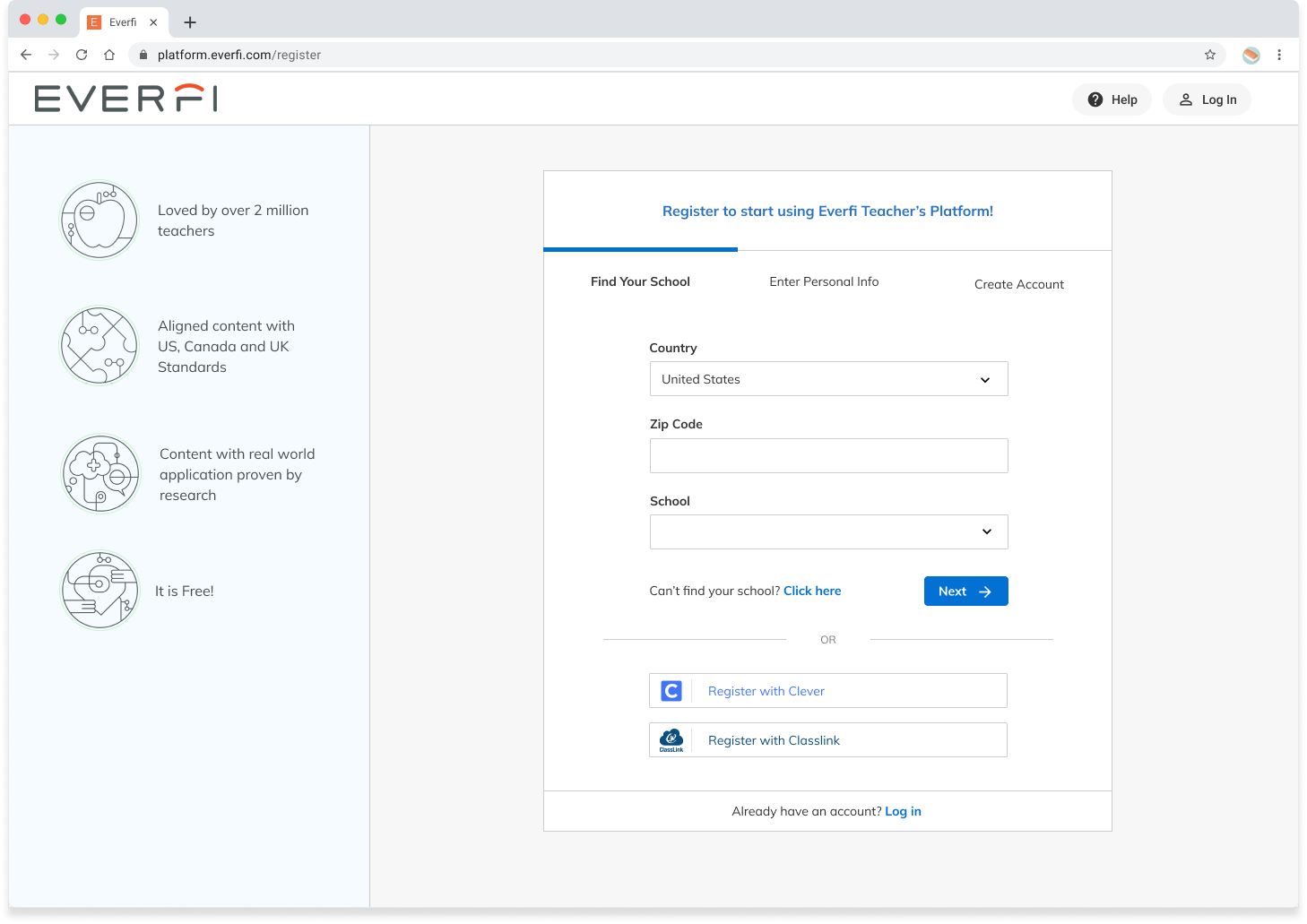
A low-fidelity screen of the registration flow
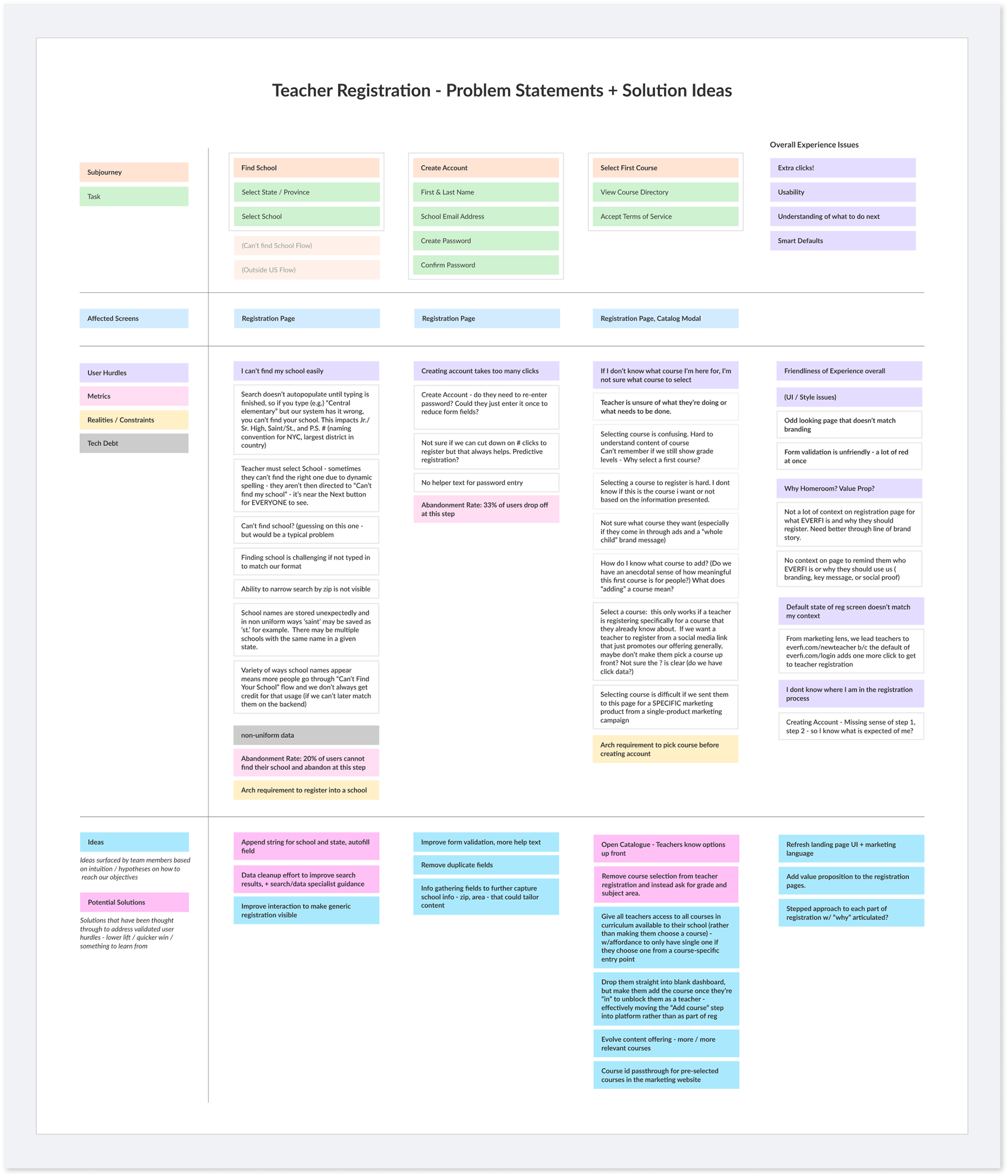
Proposed Design Changes
The followings are the changes introduced in the low-fidelity design mocks to test with users and validate:
Interaction Hurdle 1 - Add Country Selection
Previously, users’ first action was to choose their states which was confusing for teachers who were registering from Canada or UK. I added a country select field to help streamline the UX for all users.
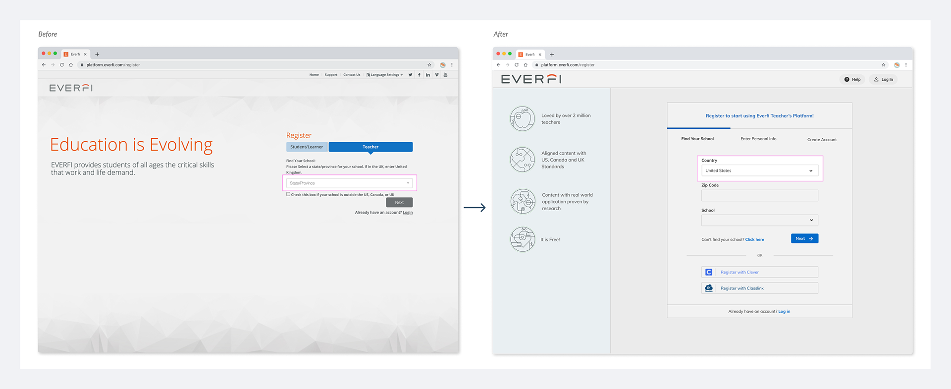
Interaction Hurdle 2 - Other Countries UX
Users could not register if they were outside the US, Canada, or the UK. I suggested using the country select field to create an easy path for users from other countries to easily register.
Interaction Hurdle 3 - Add Password Criteria
Added password criteria and provided visual cues to help users choose a password that meets the requirements easily.
Interaction Hurdle 4 - Remove Course Selection
Manual course selection was a big hurdle for users. I removed the course selection and replaced it with grade and subject fields that automatically add relevant courses to teachers' profiles.
Interaction Hurdle 5 - Add Progress Stepper
Since users expressed that they lacked a sense of progress as they were creating an account, I added a progress stepper to help teachers know where they are in the registration process.
School Search Issue 1 - Search to Browse
I separated the school search function into two fields; 'zip code' and 'school name' to help teachers find their schools more easily. By entering the zip code first, only a handful of schools in that zip code would appear to browse and select from.
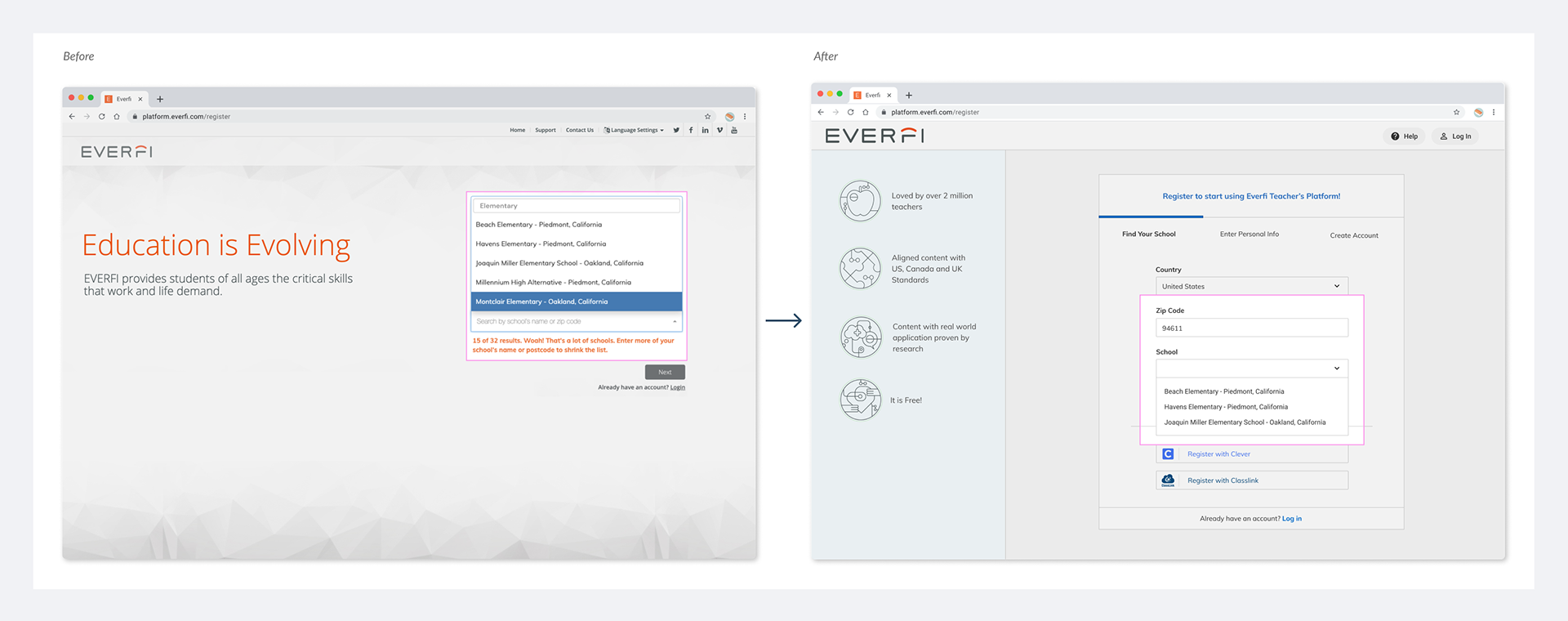
School Search Issue 2 - Omnipresent Link
I made the path to the generic registration omnipresent; if teachers could not find their school via search, they could easily find another way to create an account.
UI Issue 1 - Add Value Proposition
I added a value proposition section to help teachers understand what value EVERFI adds and why they should create an account.

UI Issue 2 - Design Consistent UI
Since teachers were still presented with a registration page designed in 2008, there was a need for a UI that could act as a bridge between the marketing website and the in-platform experience. I explored various options that would give teachers visual consistencies as they moved from the marketing website to registration pages and into the platform.
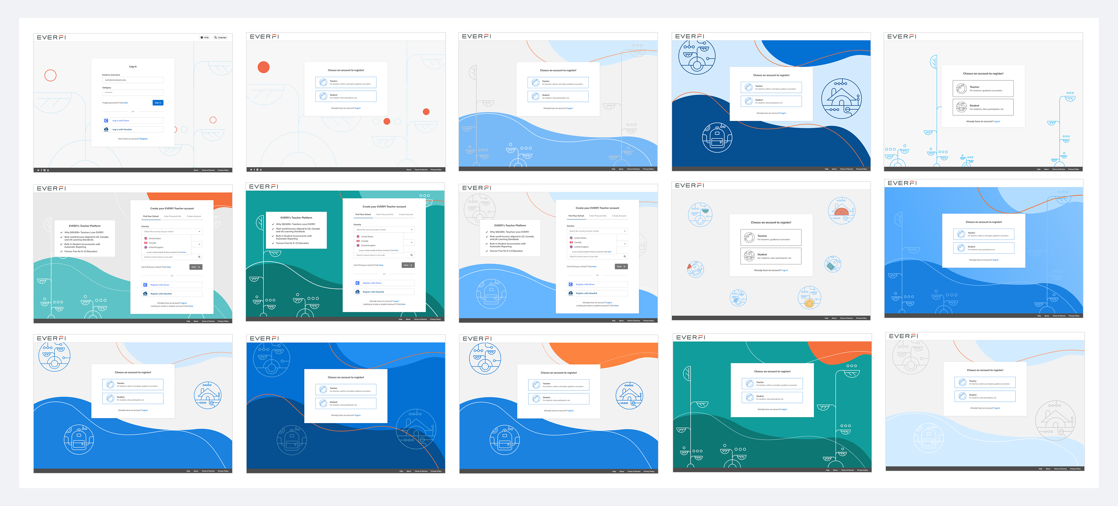
Explorations of on-brand background UI
The registration page acts as a bridge between the marketing site, where the majority of teachers come from, and the in-platform experience. I worked closely with the brand and marketing teams to implement style changes that would help teachers’ move across these pages be more seamless.
Testing and Refining
After some initial feedback from engineering and other K12 stakeholders, I created a clickable prototype to test and refine the designs.
I tested the prototype with 3 teachers to uncover any usability issues with the new direction before moving into higher-fidelity designs. Many of the previous pain points were addressed by the new designs, but there were still two issues that users shared:
1. The progress stepper did not quite address the users' needs in showing them how many steps they need to complete and where they are in the process: When asked what they thought they need to do in order to create an account, one user mentioned: “I assume I can either register by finding my school or adding my personal information” which was an indication that they thought of the progress stepper as tabs.
2. When teachers clicked the topic field in the last step of the registration, they expected to find their own subject, and when unsuccessful they did not know how to proceed.
High-Fidelity Designs
I created high-fidelity mocks to address the issues I found during the user testing. I changed the stepper UI to show progress, changed the topic field title and added help text to clarify. View the full prototype here.
A High-Fidelity screen of the registration flow
Implementation & Q/A
I created detailed specs and a clickable prototype to communicate designs with engineering. The designs included a detailed site map, page-by-page flow and interactions, and visual specs including the introduction of new fields and buttons, as well as new error states and messages. View screen-by-screen designs and specs.

Flowchart of Registration Flow for Teachers, Students, & Remote Students

Visual Spec
I worked with the front-end team to make sure the entirety of the design (including both UI and interactions) was implemented to spec. I conducted weekly meetings to desk check and QA as the new registration experience was being implemented. After release in the staging environment, I did detailed QA and created tickets to make sure the missed details were corrected before release to production.

A screenshot from my Q/A for a single page
Monitor & Report
To measure the new conversion rate and to compare this number with that of the old registration, I used Google Analytics and Google Data Studio to create a dashboard. The dashboard included different metrics that showed the overall conversion, Step 1 and 2 Registration conversion, school search efficiency, registration page bounce rate, and exit rate.
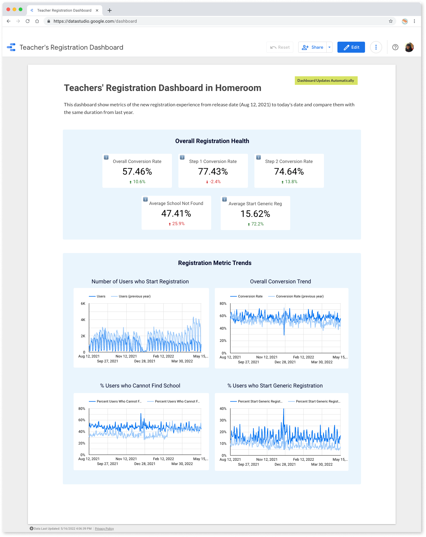
Screenshot of Registration Dashboard, 05/20/2022
What I found by calculating the conversation rate and visualizing the registration metrics:
1. Overall registration conversion increased by 10% from last year
2. This increase was likely due to changes made in step 2 of the registration flow - given that removing course selection addressed a major hurdle uncovered during the discovery.
By monitoring analytics, I also found more hurdles, for example, a small percentage of users go directly down the generic registration path without making an effort to find their school. This was a problem that required another iteration to make sure teachers are encouraged to find their schools before registering for the generic school.
Lessons Learned
This project taught me and the team a lot about how to work better together to build more user-centered products. Through an intentional discovery process - user interview, usability review, google analytics, and stakeholder interviews - we started with a shared understanding of validated problems. This not only helped us identify customers’ pain points but also come together as a team around problems and collaborate to find solutions.
Additionally, we were able to measure success and find other hurdles by looking at metrics and quantitative data, share results with the team and paint a new improvement plan for future sprints.
We were able to compare registration data with last year since we had Google Analytics tracking in place. Now that we are working on a new part of the funnel where less is tracked, we know we need to set up GA as soon as possible to have the ability to measure and iterate.
"I'd like to recognize Roshi Razavi, a principal designer on EVERFI's platform UX team, for exhibiting EVERFI's values in her work to define and improve the metrics by which we measure the success of the teacher registration funnel on the Homeroom platform.
Taking ownership of product analytics isn't typically a role played by UX designers but we had a temporary resource gap and Roshi stepped up to fill it. Roshi put dedicated effort into first learning how to use our product analytics and data visualization tools and then applying those tools to measure and track the efficacy of our K-12 teacher registration funnel. The speed at which she developed proficiency with the tools was matched only by her tenacity in testing different metrics before she found the ones which truly measured her product's success.
Thank you, Roshi for Always Showing Up, for Acting Like an Owner, and for Demanding Excellence."
by Derek Low: SVP of Data Products